2003 National League

All data in these graphs as of season end.
You can also view these related graphs:
National League East
NL as of May 4th
NL as of August 2nd
National League Central
NL as of May 25th
NL as of August 23rd
National League West
NL as of July 1st
NL as of September 13th


Runs Scored and Allowed

Comments How to Read this Graph

This is a crazy graph. According to the run differentials, two of the four best teams in the league were Houston and Philadelphia, but neither team made the playoffs. The reason: they had the two worst Pythagorean records in the league (see table). Both teams tended to score its runs in bunches, which negated some of the impact of their offense.

I've updated the graph from previous versions. First, I'm using new graphing software. I hope you like the new look. Second, I'm using Patriot's park factors, which I believe are more valid than the ones I used previously. To review other team-specific comments, please refer to the team-specific graphs under development on the Baseball Graphs home page.

Team Wins +/-
ARI -0.38
ATL 4.06
CHN 2.56
CIN 6.43
COL -3.58
FLO 3.71
HOU -7.06
LAN 1.67
MIL 2.74
MON 2.53
NYN -2.29
PHI -4.95
PIT -1.26
SDN -1.11
SFN 6.61
SLN -3.74


OBP and SLG by Team

Comments How to Read this Graph

I've made a slight change to this graph. I'm now using ISO instead of SLG to better distinguish teams from each other. You can see that this graph is more revealing than previous graphs.

For instance, San Diego stands out as a team with a clear offensive weakness: slugging. And the Cardinals' OBP was better than the Braves, but the Braves had the best league slugging, by far. Surprisingly, the Phillies' slugging also could have been better.

One other team of note is Milwaukee. As you can see on this graph, the Brewers were about average offensively; their OBP could be improved, but their slugging was above average. Yet they scored a third of a run less per game than projected. It's hard to say why, exactly. They did bat worse with runners in scoring position, but not appreciably so.

Team Runs +/-
ARI -0.18
ATL -0.02
CHN -0.06
CIN 0.00
COL 0.10
FLO -0.03
HOU 0.08
LAN -0.15
MIL -0.31
MON 0.03
NYN 0.09
PHI -0.05
PIT -0.12
SDN -0.27
SFN -0.07
SLN 0.05


Pitching and Fielding

Comments How to Read this Graph

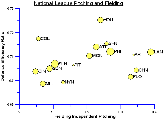
Coors Park has a huge impact on fielding statistics. When you correct DER for park, the Rockies' fielding looks much better. However, while I've tried to correct these data for park factors, I can't guarantee that I did so correctly.

Still, Philadelphia and St. Louis had some great fielding this year, while the Dodgers, Cubs and Marlins were the toast of the pitching mound. Also of note is Houston, with a tremendous park-adjusted DER. Houston's park (what's it called again?) also impacts fielding stats, but there is no denying that Houston's pitching and fielding did a very good job converting batted balls into outs.

To review other team-specific comments, please refer to the team-specific graphs under development on the Baseball Graphs home page.

New Graph!

I'm converting to some new graphing software (look for big changes next year) and I've reconstructed this graph to try and incorporate some of the most recent analysis regarding pitching and fielding. For more information, click on the "How to Read this Graph" link.